• Twitter Updates

Colour me cost-effective..

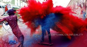
With people around the world celebrating Holi, the Festival of Colours this month, see below for some tips on how to make the most informed decision in your choice of colour printer; for whatever size of business you are in.

OKI Holi festival

In the print industry, cyan, magenta, yellow and black are used as the primary colours. Most printers use the CMYK colour model.

CMYK refers to the four inks used in most colour printers: cyan, magenta, yellow, and key (black). The “K” in CMYK stands for key since in four-colour printing cyan, magenta, and yellow printing plates are carefully keyed or aligned with the key of the black key plate. Some sources suggest that the “K” in CMYK comes from the last letter in “black” and was chosen because B already means blue. However, this explanation is incorrect. Of course, as most of you know, OKI was the first to bring out CMYW for white toner based printing.

We once lived in a blacGraffitik and white world. TV was black, printed publications were predominantly black. All of that changed in the 60’s and has created a chain reaction that holds true today. Less than ten years ago, in-house colour printing was still an expensive hobby. Today, businesses in the Middle East are using printers that produce their colour documents quickly, consistently and cost-effectively and are hence able to communicate more effectively with their own customers.

 Studies in a major publication revealed that the use of colour increased readership by 40% or more. A university study showed a 65% increase in the retention of material when full colour was used instead of black and white.

Some businesses are perhaps put off by using colour in their printed documents as it creates a dent in their budgets. This is a misconception. Using colour is not as expensive as you may think. If you need the highest-quality colour pages-say you print out presentations and brochures or you’re an organization who needs top-notch flyers-spending the extra cash for a colour toner based printer makes sense. These printers give you the cleanest and sharpest results. Also, toner based printers print out long documents quickly, at roughly twice the text speed of typical ink jets.

Whether your printer costs $40 or $400, the purchase price is only the first item on your new list of ongoing printing expenses. Over time, buying the consumables or toner and acquiring media (paper, envelopes, card or transparencies) will very likely make a far bigger impact on your wallet. These costs will vary depending on what you print, how much you print, and what kind of media you use.Bastakia nights

Shaving cents off  colour printing involves just a little thought, effort, and advance planning. It is a bigger issue than many companies think. With a set of replacement ink cartridges for inkjet printers costing anything up to $55 a time, an office of 20 ‘heavy’ users could be spending over $1,000 a month on ink!

  • Know Before You Buy – Saving money on printing starts (ideally) before you buy the printer. Before you begin researching new models, make sure that you’ll be getting the best printer for the types of documents you plan to produce. Once you start looking at specific models, make a point of checking the recommended print volume; if you typically print 100 pages a day, for example, don’t buy a printer that’s rated for 500 pages a month.
  • If you do a lot of document printing, don’t use an inkjet printer. Use a toner based printer. Toner based printers cost more to buy but much less to use. With all costs figured in, each document page printed on a typical toner based printer costs from 2 cents to 5 cents; on an inkjet, the cost per page can run from 10 cents to 15 cents, depending on the model. This does not even count the cost of photo printing, which can cost up to a dollar per page on an inkjet when you include the high cost of photo paper and the additional ink that’s used in that mode.
  • Know your hidden costs – Choose a printer not only on the basis of its performance and speed but on the cost of the consumables and not on the cost of the printer. Ink costs swallow up all other expenses over a couple of years of use. Even machines using similar technologies can have very different operating and consumables costs. Evaluating the ongoing costs of a printer can produce some surprising results.
  • Don’t judge a cartridge by price alone; its efficiency, or page yield—the number of pages it can print–matters just as much. Of course, that figure will vary depending on how much ink you use on a page, but the industry standard assumption is 5 percent coverage per page for each colour. Some companies make yield information available on the Web along with other printer specifications; others will provide it if you ask, either by email or phone. You can use yield information to calculate per-page costs, which can be useful in determining what your printing costs for different printers would look like over time. Toner based printer toner cartridges may cost a lot more than ink jet cartridges, but their higher yields make per-page costs lower.
  • The incredible shrunken ‘starter’ cartridge – Many lower-cost toner based printers come with starter cartridges that last anywhere from 60 percent to as little as 33 percent as long as a regular cartridge. Granted, if you don’t print much, that first cartridge could last you a while; but if you know you’ll be printing at least 100 pages per month, either find a printer that comes with a full-size cartridge or factor in the cost of an early replacement. Of course, if you get a great deal on the printer, your overall cost may still be quite affordable.
  • Using standard paper for the job – The heavier, brighter (whiter), or more specialized the paper is, the more it will cost. You’ll generally pay as little as a half-cent per page for typical, 80gsm office paper, or as much as a dollar for an A4 sheet of glossy photo paper. Save the pricey stuff for final prints; for everything else, use decent quality standard copier paper. It will affect the print quality from your toner based printer minimally, if at all.
  • Print using “Draft” mode whenever possible – This won’t help when printing photos, but can save a lot of money over two or three years when you print everyday documents.

Do you have any tips on choosing a printer for your office? Let us know!

Show off your true colours with OKI

White Toner..whatever next!

It was over 35 years ago when IBM introduced the first toner-based printer and nearly that long since people started using toner copiers and printers as a way of digitally transferring images or photographs onto material. The simple method of using laser printed heat transfers has allowed businesses to personalise any kind of promotional item they can think of, from mugs to umbrellas to shopping bags.

However this has always been limited to white/ light coloured backgrounds, that is until OKI decided to remove this barrier to creativity and design!OKI White Toner Products

As shown by our partners The Magic Touch and Forever at Sign Graphics and Imaging Middle East (SGI Dubai 2013), the new white toner-based products are versatile, easy to use and, as there is no drying time required, enable much faster and more cost-effective printing than the traditional inkjet or dye-sublimation technologies. At the same time, the robust solid print output is just as good as foil blocking, making it a credible in-house solution for a wide range of white print applications.

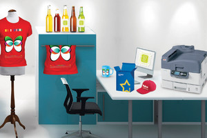
Magic Touch MerchandiseFrom small business printing single t-shirts on demand to large screen printers looking for a fast and effective alternative, using the white toner printer allows almost anything to print on dark coloured garments or other dark coloured substrates without any cutting required. This versatile system can also be used in industrial production for items such as printing on wood, leather, ceramics, metal, glass, carton or other coloured substrates. Printed output offers consistent high quality and robust performance, as it is scratch resistant compared to inkjet-based competitors.Leather bag sample from Forever

Infographic: What your brand colours say about your business

We came across this cool infographic on colour psychology in business via sgentrepreneurs on pinterest. Being strong believers in the power of colour ourselves, we thought it was a creative way to demonstrate how colour can and should be used effectively in business communication. How are the world’s top brands using colour in their logos? What do your brand colours say about you? How do consumers react to certain colours? It’s all displayed simply for you below.

Image

The Science of Colour: Understanding Colour Psychology for Effective Business Communication

Image


Did you know that invoices printed in red are paid up to 70% faster? Or that yellow cars have notoriously high accident rates? Whether you choose to acknowledge it or not, colour psychology plays an important role in our everyday lives both here in the Middle East and around the world.


Everything from the paint on your villa wall to the clothes that you wear have the ability to subconsciously affect mood and behaviour. Colour psychology goes beyond cosmetic appearance and actually plays a significant role in the business world. In fact, the colours you choose to use on your printed documents have the ability to affect the decisions of consumers from a business perspective and impress your customers for good or for ill.


Research commissioned by OKI has found that human response to colour can be predicted and that it is indeed a powerful form of communication that is driven by our deepest instincts.  Regardless of nationality, culture and gender, we as human beings share common reactions to colour. These reactions can be predicted with startling accuracy when one has an understanding of the science behind colour.


So, how can colour psychology help a business in the Middle East and Africa? On average, a customer takes 15 seconds to make a purchasing decision. This means that it is important to grab your customer’s attention before they even notice aspects such as typeface, copy, and layout.  The skilful use of colour and ensuring that the colours you use are related to the basic proposition of your product will help convey your key messages effectively.

For instance, blue is an essentially soothing colour and when used correctly, can imply intelligence, trust, and serenity. This would be a good colour to use if you want your customers to trust you.  Then you have red, which has a physical effect. In contrast to blue, the colour red stimulates and activates a “fight or flight” reaction. Think about why red is so effective in stop signs and traffic lights.  Red could work if your company has anything to do with sport or physical activity or if your business needs to appeal more to the senses than to the mind, red will work well.

Gaining a general understanding of the 11 basic colours that have fundamental and universal psychological properties can help you communicate more efficiently, depending on your line of business.

Remember, nothing is as black and white as it may seem!


How to win an Oki colour printer at Gitex 2011

Join us at Gitex 2011 for a quick Print Bingo game at our stand to win a brand new Oki colour printer.

Here is how you can do it

–         Come to Oki stand at hall 4 stand No. 416

–         Collect your Print Bingo Card

–         Cross out the names of our printers from your bingo card as we call them

–         First one to cross out the 9 names and shout Bingo wins a new Oki C110 colour printer

We run two games per day at 2pm and 4pm, except for the last day we’ll hold 1 game only at 2pm.

Check out photos from first day at Gitex

Why Buy an LED and not Laser Printer

Digital LED and laser technologies are alike due to the fact that they both use toner for cleaner, crisper images and they both use a heated roller to adhere the toner to the page. However, these two technologies are also widely different:

Simplicity: The most significant difference is that LED printers use a solid-state light source that is far less complex than laser, with no moving parts.

Quality: Digital LED uses multiple light-emitting diodes to create images one full line at a time. It provides a high concentration of light at the center of the dot and hence, delivers sharp details and rich color depth up to 1200×1200 dpi. Laser, on the other hand, relies on elaborate combinations of rotating mirrors and lenses. It renders each dot individually, scanning across each line and then returning back to the next sequence.

Speed: While an LED printhead writes image directly to the drum in one step, laser technology requires a seven-step process to accomplish this task. This process starts with a single light source, and then moves to focusing, reflecting and refracting the laser beam. Afterwards, the rotation of the polygon mirror takes place followed by synchronizing the start line and at last writing the image onto the drum.

Environment: Another major issue to be considered when choosing a printer or a set of printers for your company is Environment.  LEDs consume less electricity than other materials; they have been attracting attention recently as a useful lighting device to curb global warming due to the greenhouse gases released by electricity generation using fossil fuels. Even in its idle mode, an LED printer consumes 2 Watts of electricity compared to 10-20 Watts of that of a Lazer printer. A saving up to 80% on power during weekends and holidays is a valid reason to factor in when considering environmentally friendly products.  For big companies that use thousands of printers in its premises this saving impacts their green approach as well as their budgets.

At OKI we have chosen to develop digital LED technology because we believe it is a technological winner. LED technology is the future. Its various beneficial features are expected to lead a massive surge in high-speed color printers and ultra-high-speed large-scale printers which will make full use of LED’s characteristics. We can see the result now as LED technology continues to show a fast pace of continuing innovation while other technologies are stagnating.

So the question now is, if LED has proven to be worth the investment when will the rest of the vendors who still insist on using older technology join in and provide the HD Printing that answers their customer needs?

Beirut, here we come!

We are gearing up for yet another exciting event in Lebanon to launch some products, host an exhibition, catch up with our loyal customers  and have the best tabbouleh and hommus in the world!

In a joint event with our partners, PSI, we will be

Source: Wikipedia

addressing the office environment with new printing solutions guaranteed to slash down the costs of in-house printing and deliver top quality output that any professional needs.

The afternoon event is dedicated to the graphic art market where an exhibition for Joumana Medlej (@CedarSeed) is taking place in the same venue. The artwork is printed on the outstanding  C910 from OKI.  Photographers, graphic designers and art lovers are invited to a cocktail reception  to enjoy Malaak’s stories  some of which are yet to be published in 2011!!

The event is taking place on Thursday the 4th November at the Metropolitan Hotel in the Bary Hall. The morning conference is starting at 11:00am and the exhibition is open from 4:30pm onwards.

BTW- Geekfest Beirut is also taking place on the same night later on in Plum Monot. More information can be found here: http://geekfestbeirut.com/

Looking forward to welcoming you all,

The OKI Team.

Colours … your silent sales person!

When designing your company’s logo, do you carefully consider your choice of colours or do you just keep trying colours till you see something you like? How about when designing your promotional materials? What about your customers, do you consider what colours appeal to them or do you just say “if it looks good they will like it?”  Many people still think that the effects of colours in business are purely cosmetic but appearance is very small part of the vital role it plays in impressing your customers. As simple as it may sounds, the colour thrust of your printed material whether brochures, presentations or reports, can open the initial door to your customer mind much more quickly than mere words.

Colours can influence your business and customers in more ways than you could expect.  Colours are a powerful form of communication that derives from our deepest instinct and it’s always in play. Customers’ immediate response will always be to the colours first. They are the first thing we look for to give us information about everything that confronts us. Understanding colour psychology and how it works helps you use colours to influence your customers’ responses to your products and printed materials.

In one of the latest reports in collaboration with OKI Printing solutions, one of the world’s largest colour printer manufacturers, we managed to lay down some guidelines to help business owners harness the power of colours, when producing their own in-house colour documents. There are two things you have to consider; harmony and reactions to colours.  It’s a scientific fact that we do not respond to one colour – but to all the colours we see; there is no bad colour, just bad colour combinations. One of the most common mistakes businesses make is that of leaving the corporate colours out of the equation when they decide to produce an important promotional document. Every colour you are considering for your document should go with each of the logo colours, this will ensure that the whole document serves to enhance and reinforce your company values, and there are no mixed messages. Colour documents in general provoke between 60 and 70% more response than black and white. However, using colour for the sake of colour can be counterproductive.

So how can you choose the right colour for your materials?

It is commonly thought that red is always a winning colour for a corporate because red stimulates us physically and communicates strength and power. However – before you rush to red for your logo or other printed materials, please pause for a moment: there is no such thing as a universally good colour. Red is potentially exhilarating and exciting but if it is not right for your brand, it can be horribly aggressive, demanding and a strain. Impact for its own sake is not enough.

In a research sponsored by OKI Printing Solutions we established that response to colour is a psychophysical, universal phenomenon that works on two levels:

Each of the eleven main colours has its own universal effect; that is the first level. However, in practice the effect can be positive or negative. Once you understand what each main colour communicates, decide which one best captures the most positive aspects of your business and then treat that colour with great respect; make sure that you never forget to pay attention to the colours you use with it, so that it always looks good and evokes a positive response.

To make things easier we cracked the main colours code to help you understand their psychological effect

Red:

Positive: Physical courage, strength, warmth, energy, basic survival, stimulation, masculinity, excitement

Negative: Defiance, aggression, visual impact, strain

Red has the property of appearing closer than it is, and therefore catches the attention first – it has the most ‘stand-out’.

Used wrongly, it can be perceived as a strain – aggressive and very harsh.

If you are selling consumer goods, if your company has anything to do with sport or physical activity, has retail outlets trading in leisure activity or the home, or your business needs to appeal more to the senses than to the mind, red will work well.

Blue:

Positive: Intelligence, communication, trust, efficiency, serenity, duty, logic, coolness, reflection, calm

Negative: Coldness, aloofness, lack of emotion, unfriendliness.

Blue is the colour of the mind. Strong blues stimulate clear thought and soft blues aid concentration. We instinctively associate blue with clarity and with things working efficiently

Used wrongly it could be perceived as cold, unfriendly and bureaucratic.

Blue will work very well if you need your customers to trust you – solicitors, accountants, insurance companies, technology companies and roofing contractors.

Yellow:

Positive: Optimism, confidence, self-esteem, extraversion, emotional strength, friendliness, creativity

Negative: Irrationality, fear, emotional fragility, depression, anxiety

Yellow is a warm, bright, uncomplicated colour and it stimulates the ego and emotions.

Used wrongly it can cause anxiety, and when used with black it sends a strong signal of danger.

Yellow is an effective colour if you are communicating anything new, or anything associated with the young. It is, however, quite a difficult colour to use in graphic design because, oddly, it is not as visible as other colours

Green:

Positive: Harmony, balance, refreshment, rest, restoration, reassurance, environmental awareness, peace

Negative: Boredom, stagnation, blandness, enervation

Green is the colour of balance; it strikes the eye at a point where no adjustment is necessary in order to look at it, so it is restful.

Used wrongly it can be stagnant and far too bland, encourages stillness and lack of action.

The reassurance of green will be effective for just about any organisation, but particularly for a business whose customers are likely to be tense or nervous – e.g. doctors, dentists or anything medical, or driving schools.

Violet

Positive: spiritual awareness, containment, vision, luxury, authenticity, truth, quality

Negative: introversion, decadence, suppression, inferiority.

Often described as Purple, it turns energy in, rather than out, and soothes the emotions.

Used wrongly, purple can come across as false, and reflect anything but premium quality.

Purple will work well for any company concerned with the New Age, or who are selling the finest quality goods at the top of the market.

Orange

Positive: Physical comfort, food, warmth, security, sensuality, passion, abundance, fun

Negative: Deprivation, frustration, frivolity, immaturity.

Orange stimulates the body and the emotions. It is sensual, and activates awareness of secondary survival issues – food, warmth, shelter and physical enjoyment.

Used wrongly it could reflect lack of seriousness, or intellectual values.

Orange is the most powerful colour for selling food, heating systems, anything associated with home comfort – and pure fun. 

Pink

Positive: physical tranquility, nurture, warmth, femininity, love, sexuality, survival of the species

Negative: inhibition, emotional claustrophobia, emasculation, physical weakness  

Pink is physically soothing and nurturing; it represents the feminine principle, motherhood and survival of the species.

Used wrongly it can be physically draining and men will find too much of it emasculating.

If you are selling feminine products of any kind, lingerie, cosmetics or women’s fashions, pink will capture that essential femininity. Strong fuchsia is the colour of militant feminism!

Brown: 

Positive: Seriousness, warmth, nature, earthiness, reliability, support

Negative: Lack of humour, heaviness, lack of sophistication.

Brown is essentially a serious colour it is always the best colour to communicate no-nonsense, down-to-earth ideas.

Used wrongly it could be perceived as humourless and heavy.

Brown would probably not be a strong enough colour to be effective as a main corporate colour. However, if your business is anything to do with the environment, or the natural world, brown is a far more effective secondary colour than black.

Black:

Positive: Sophistication, glamour, security, emotional safety, efficiency, substance

Negative: Oppression, coldness, menace, heaviness

It is a cold colour and uncompromising; it can be menacing. It certainly is not neutral. It can be very effective in communicating sophisticated elegance, materially aspirational products and glamour. Don’t use black with red for your company if you do not want to remind people of the aggressive and arrogant attitudes of the Third Reich!

White:

Positive: Hygiene, Sterility, clarity, purity, cleanness, simplicity, sophistication, efficiency

Negative: Sterility, coldness, barriers, unfriendliness, elitism

Pure white can be a cold and uncompromising colour because it reflects all wavelengths, thus creating barriers. It is a very strong colour, with a very strong psychology – not by any means, as is widely thought, neutral. It is aspirational and communicates uncompromising quality, hygiene, sterility and attention to detail.

If you wish to use white for your company, make sure the colours with it are cold and sharp; if you use it with the kind of warm friendly colours that most companies favour, it will turn them from warm and friendly to cheap, and possibly aggressive.

Grey

Positive: Psychological neutrality

Negative: Lack of confidence, dampness, depression, hibernation, lack of energy

People will tell you that grey is elegant. Sadly, except under very specific circumstances, this is not so. Grey says virtually nothing, and usually indicates lack of confidence. It is never to be recommended in any corporate communication.

So the next time you plan designing any of your promotional materials consider well your choice of colours and remember that they are your silent sales person.